Wednesday, 16 December 2015
Horizontal Advert Process (Part 2)
For the horizontal advertisement, I have begun adding typographic features, such as the release date, the ways in which the album can be purchased, as well as including the review quotes from magazines. For the horizontal advertisement, I am taking into consideration the fact that I must avoid the typographic features covering the artist's face. For know, I am aiming to position my typographic features, and then proceed to adding the colours and effects necessary for the advert to stand out and make it seem realistic and professional. Despite not having much on the page, I have a clear vision of what I want to produce for the horizontal advert.
Tuesday, 15 December 2015
Making the Advert (Part 1)
Today in class I have started to make the advert of Sia's Eye of the Needle. I have decided to make a vertical and horizontal advert!
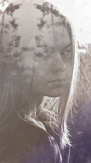
I have decided on the image I will use for my horizontal advert, with the help and advice of my teacher and class peers. I have started to add text and will continue to show my progress!
I have decided on the image I will use for my horizontal advert, with the help and advice of my teacher and class peers. I have started to add text and will continue to show my progress!
Monday, 14 December 2015
CD Digipack and Advertisement Pitch Videos and Feedback (Part 1 & 2)
From my proposal pitch, I received a lot of positive feedback, reassuring me that I have presented my ideas in full-detail and precision. As soon as I finished my presentation, I received positive feedback. My teacher Amy had found the promotional method of releasing teaser methods really interesting. In addition, my team member and peer Aamna liked my idea of having the option between pastel/simple colours and vibrant, bright colours as the pastel colours can hold symbolism and connotations of innocence and a positive "happy feel" to the CD digipak and advertisement, providing a unique look to the album and advert. I was told that I had included successful symbolism, through the doll, key and the artist herself. Amy had complimented my proposal with the statement "He covered everything". Despite being only a small amount of feedback, it allowed me to know that my ideas were successful and appropriate. It also showed that I had covered everything necessary/important for my album and advert.
Photography for CD Digipack and Advertisement
Subscribe to:
Comments (Atom)


